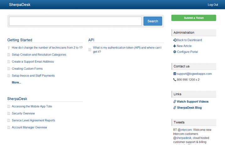
If you use our knowledgebase (if you're not, you should), you'll notice some big changes we made recently.
Hey! Why did you do that?
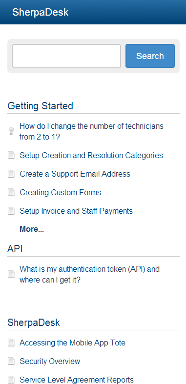
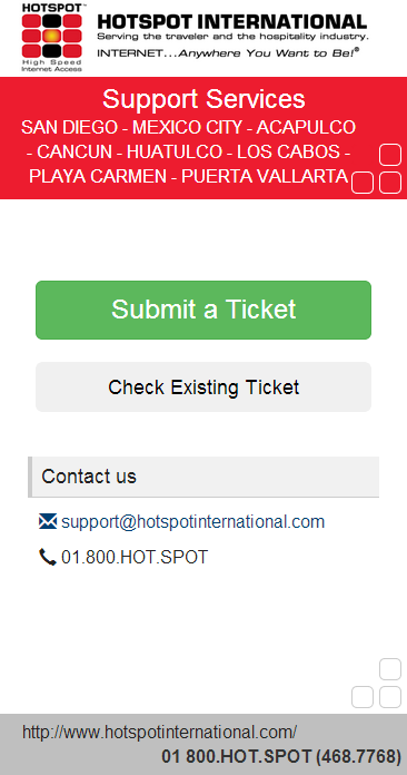
Well one word really summarizes the change - responsiveness. Our old portal design was a fixed width that did not allow for multiple device uses. We also freshened up some of the design elements. You'll notice updates to icons, the search bar and the right side bar. We've made tweaks to the articles too. All this is all an effort to help you connect with your customers where they are, whether that's on a desktop, a tablet, or mobile device.
Bootstrap... huh?
In an effort to make as easy as possible to customize your header and footers, we've based this update on the popular bootstrap v3 front end framework. This well document framework makes it really easy to create responsive headers and footers. We used their CSS grid system as well as several of the other elements. Check out bootstrap.com to find out more.
Coming Soon... Even more!
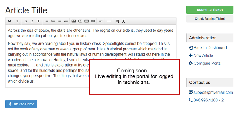
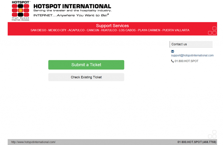
Here's a peak at one of the big things we're working on:


%201.png?width=559&height=559&name=close-up-women-working-with-devices%20(1)%201.png)
